品牌视觉 / Branding
● “设计好品”中国室内设计美居品牌发现之旅由广州卡撒传媒发起,涵盖沙龙、论坛、专访、盛典和品牌榜五大板块。通过联动行业资源,发现并推荐优秀泛家居品牌,探索设计与品牌协作的新发展。
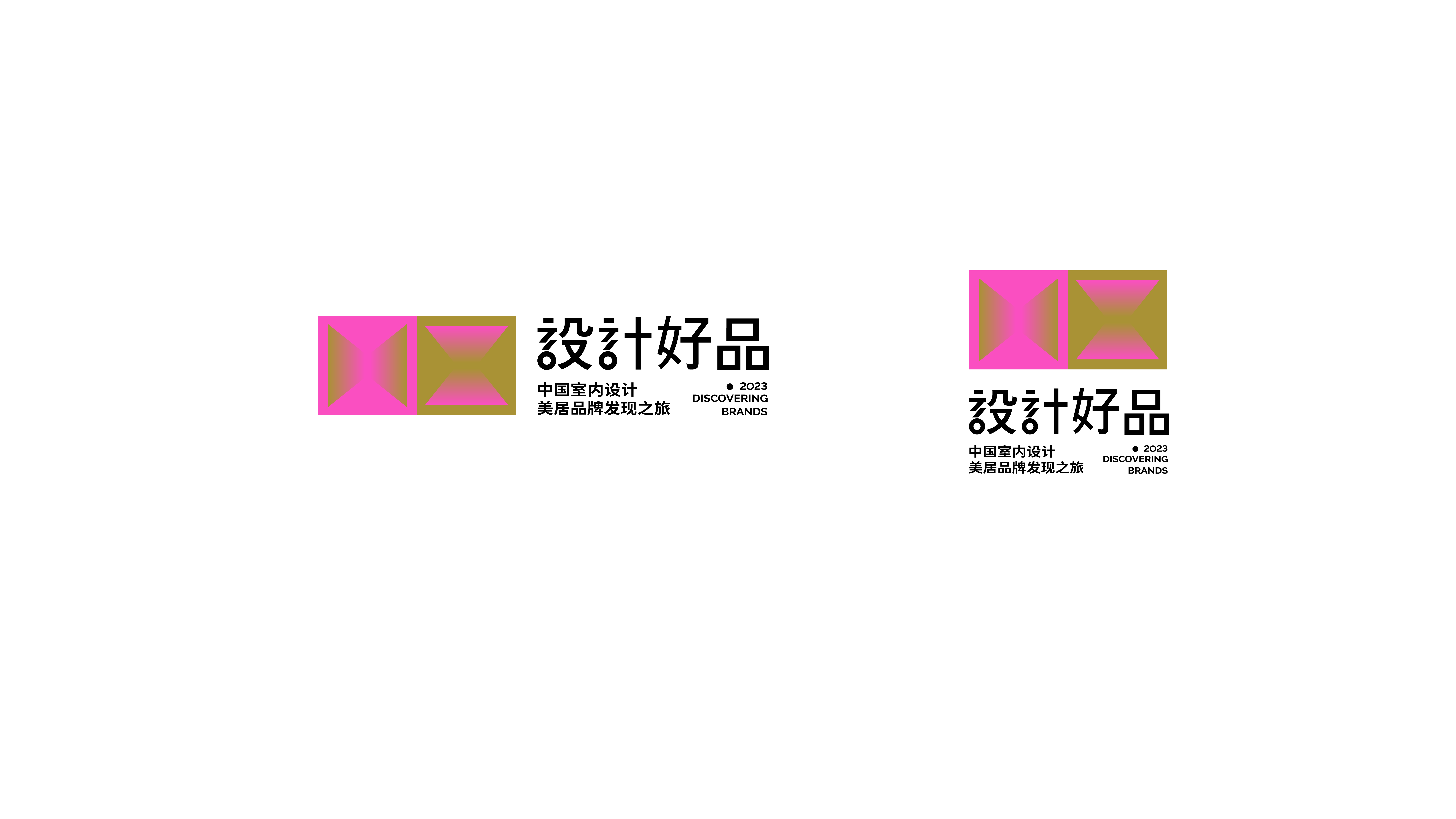
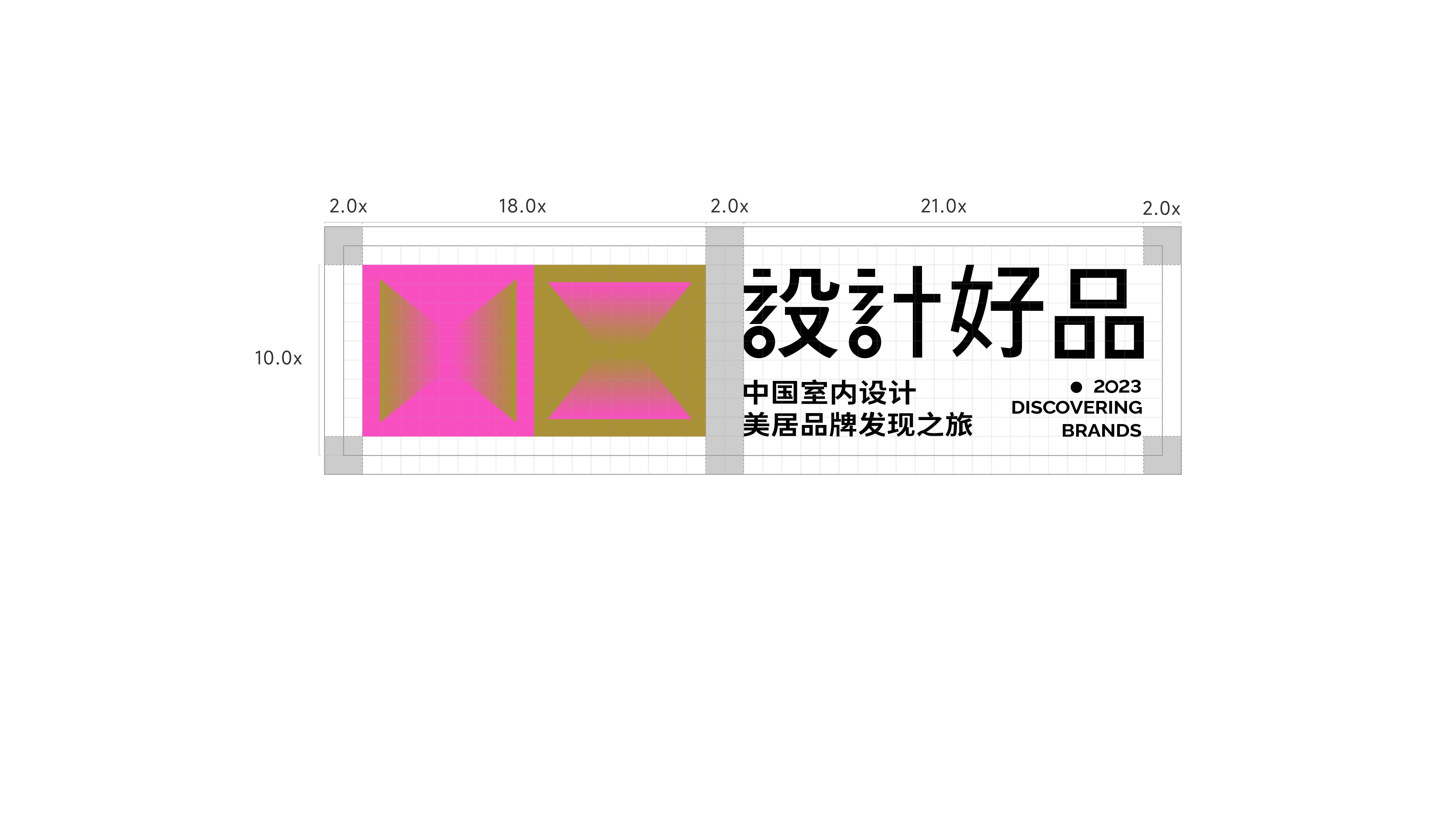
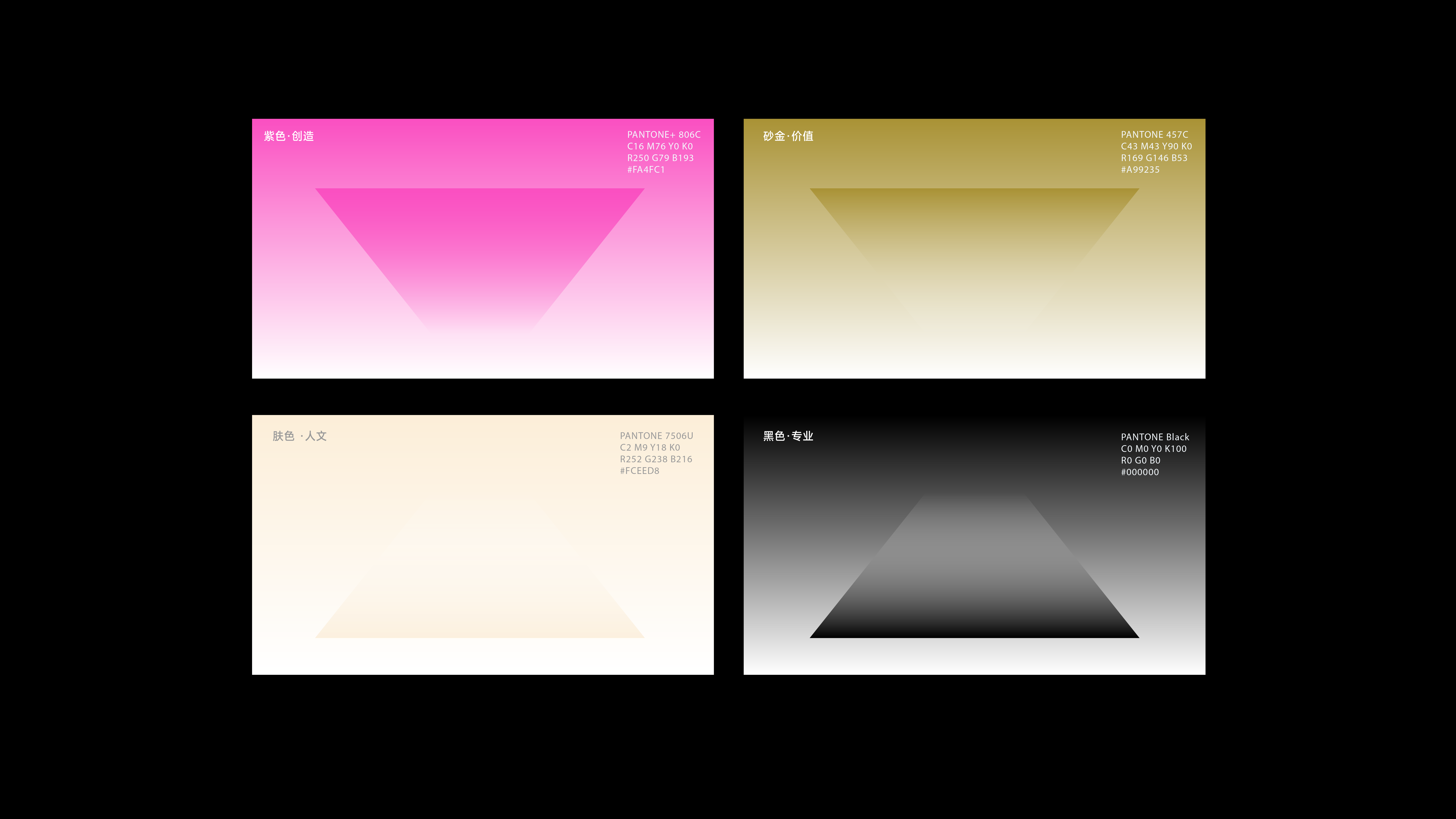
标志从空间构成的四个面出发,打破边界,创造流动与融合感,象征室内设计在有限空间内的无限可能性。四个面的存在也代表着不同的空间和视角,突出设计的多样性与适应性。图形以跳动、变形和延展的方式呈现,传达了设计领域的创造力和不断演进的特性。标志采用高饱和的紫色和金色,紫色象征创造性与独创性,金色代表设计的高级感与卓越品质。
● "Design Excellence" is a journey to discover Chinese interior design and home décor brands, initiated by Guangzhou Casa Media. It covers five key segments: salons, forums, interviews, galas, and brand rankings. By connecting industry resources, it aims to discover and recommend outstanding home and lifestyle brands, while exploring new developments in the collaboration between design and branding.
The logo is derived from the four surfaces of a space, breaking boundaries to create a sense of flow and integration, symbolizing the infinite possibilities within the limited space of interior design. The four surfaces also represent different spaces and perspectives, highlighting the diversity and adaptability of design. The graphic is presented through rhythmic, deformed, and extended forms, conveying the creativity and ever-evolving nature of the design field. The logo uses highly saturated purple and gold: purple symbolizes creativity and originality, while gold represents the sophistication and excellence of design.
设计好品
Time/2024● “设计好品”中国室内设计美居品牌发现之旅由广州卡撒传媒发起,涵盖沙龙、论坛、专访、盛典和品牌榜五大板块。通过联动行业资源,发现并推荐优秀泛家居品牌,探索设计与品牌协作的新发展。
标志从空间构成的四个面出发,打破边界,创造流动与融合感,象征室内设计在有限空间内的无限可能性。四个面的存在也代表着不同的空间和视角,突出设计的多样性与适应性。图形以跳动、变形和延展的方式呈现,传达了设计领域的创造力和不断演进的特性。标志采用高饱和的紫色和金色,紫色象征创造性与独创性,金色代表设计的高级感与卓越品质。
● "Design Excellence" is a journey to discover Chinese interior design and home décor brands, initiated by Guangzhou Casa Media. It covers five key segments: salons, forums, interviews, galas, and brand rankings. By connecting industry resources, it aims to discover and recommend outstanding home and lifestyle brands, while exploring new developments in the collaboration between design and branding.
The logo is derived from the four surfaces of a space, breaking boundaries to create a sense of flow and integration, symbolizing the infinite possibilities within the limited space of interior design. The four surfaces also represent different spaces and perspectives, highlighting the diversity and adaptability of design. The graphic is presented through rhythmic, deformed, and extended forms, conveying the creativity and ever-evolving nature of the design field. The logo uses highly saturated purple and gold: purple symbolizes creativity and originality, while gold represents the sophistication and excellence of design.


